A eventos ❤️ do bem é uma plataforma de arrecadação de recursos P2P dedicada a ONGs, cujo objetivo é transformar eventos comemorativos e divertidos da vida das pessoas em motivação para campanhas de arrecadação voltadas a projetos socioambientais. Nós tratamos do problema do subdesenvolvimento da cultura de doação Brasil. Nossa solução é que, tendo como motivação eventos comemorativos pessoais dos mais diversos, como:
Bodas de casamento
Aniversários
Formaturas
Corridas de rua
Entre outros
Pessoas criem campanhas de arrecadação personalizadas (chamadas “eventos do bem”) em que, ao invés de presentes, pedem às suas respectivas redes de amigos e familiares doações ao seu projeto social de interesse. Isso porque o vínculo afetivo é um fator comprovadamente mais significativo para converter uma doação. Após o término do evento do bem, é publicado na página da campanha um “relatório de impacto”, em que são apresentados elementos de ilustração do impacto gerado pelas doações, por exemplo: fotos e vídeos do trabalho da ONG apoiada, depoimentos escritos ou filmados de participantes (beneficiaários ou funcionários da ONG), uma métrica de conversão das doações em impacto social (ex.: R$100 = material escolar para 10 crianças por um mês) e as notas fiscais escaneadas dos depósitos na conta da ONG. Desta forma, ataca-se o problema de falta de transparência na prestação pública de contas, ao mesmo tempo em que se tangibiliza para o doador a importância de seu esforço. Nossas campanhas de arrecadação por eventos pessoais, aliadas a um feedback de impacto são nossos principais diferenciais.
Colaborando com o projeto
Se você é um desenvolvedor apaixonado por tecnologia e quer alinhar isso com causa social, você esta no lugar certo. Aqui você poderá nos ajudar, liberando correções e melhorias. Para maiores informações, entre em contato com dev@eventosdobem.com.br
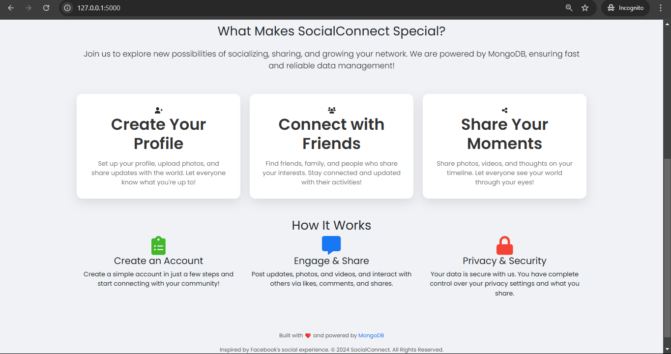
MongoPostConnect is a full-stack web application built with Flask and MongoDB, where users can post multimedia content, like and comment on posts, and manage their personal profiles. The application uses Flask for backend handling, MongoDB as the database, and GridFS to store multimedia files such as images.
Features 🌟
User registration and login with secure password hashing 🔐.
Post creation with the ability to add multimedia content (images) 🖼️.
Post editing and deletion (only by the creator) ✏️❌.
Commenting and liking functionality on posts 💬👍.
Profile page where users can view their posts 👤.
Full authentication system using Flask-Login 🔒.
Tech Stack 🛠️
Backend: Flask
Database: MongoDB (with GridFS for multimedia)
Authentication: Flask-Login, Flask-Bcrypt
Frontend: HTML, CSS, Bootstrap
Other: PyMongo, GridFS
What is MongoDB? 🌱
MongoDB is a NoSQL document-oriented database that stores data in flexible, JSON-like documents, which makes it easy to store, query, and manipulate complex data. Unlike traditional relational databases, MongoDB does not require predefined schemas and tables, providing more flexibility for developers to store and retrieve data. MongoDB is scalable and designed to handle large volumes of data, making it ideal for applications that need to process high amounts of unstructured data. In this project, MongoDB is used to store user data, posts, and multimedia content, while GridFS is used for storing large files such as images.
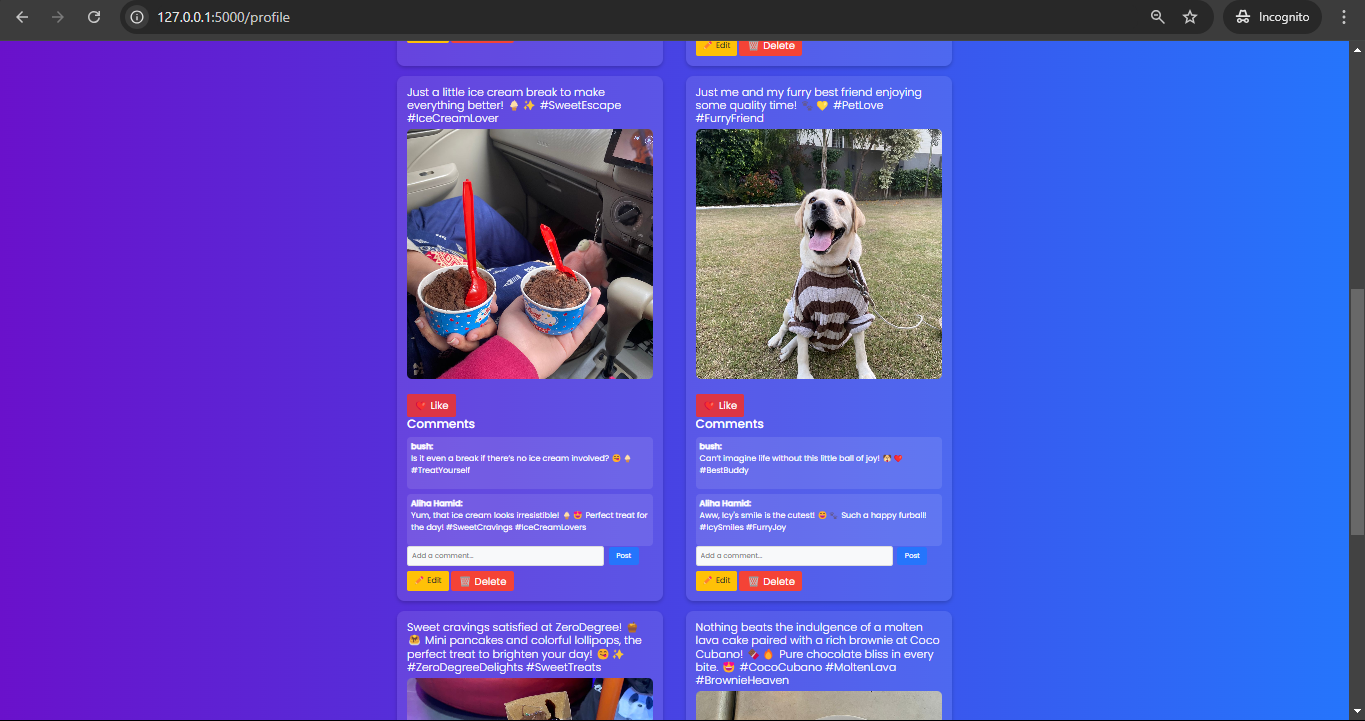
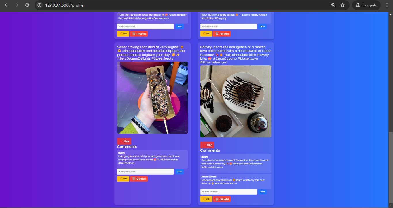
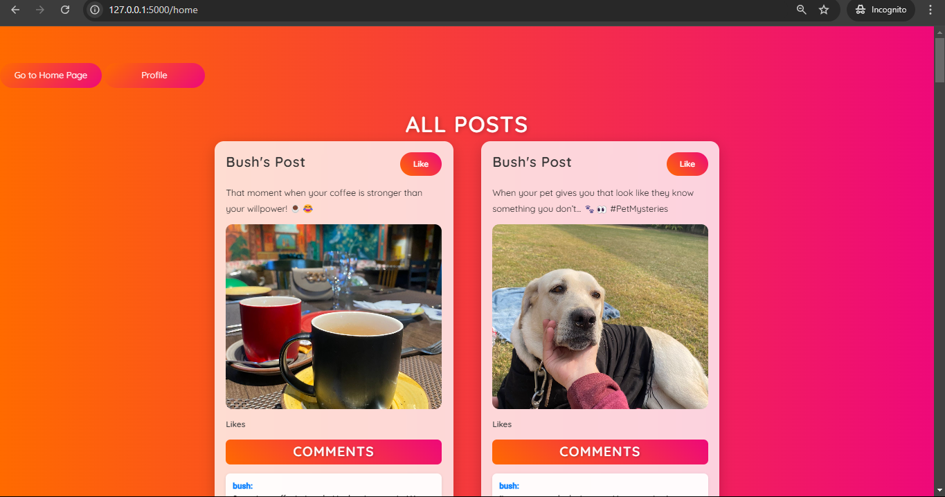
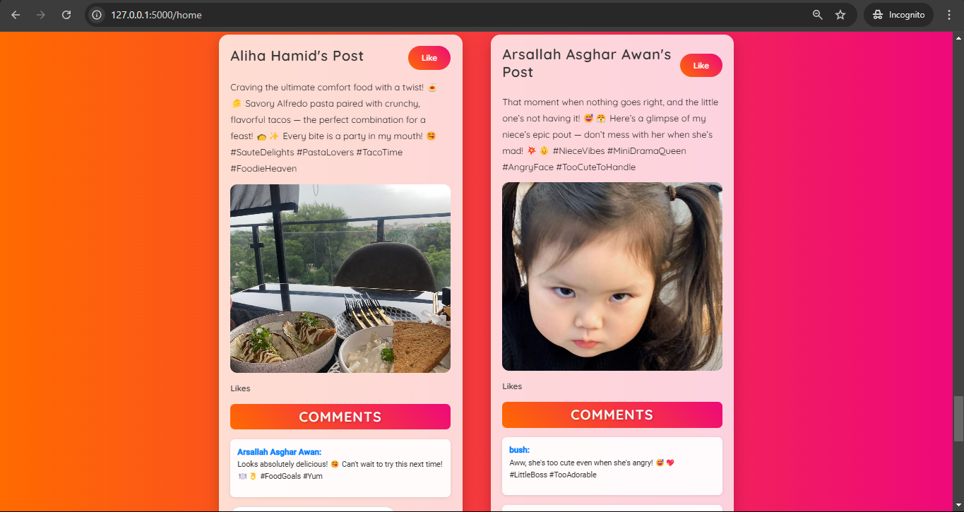
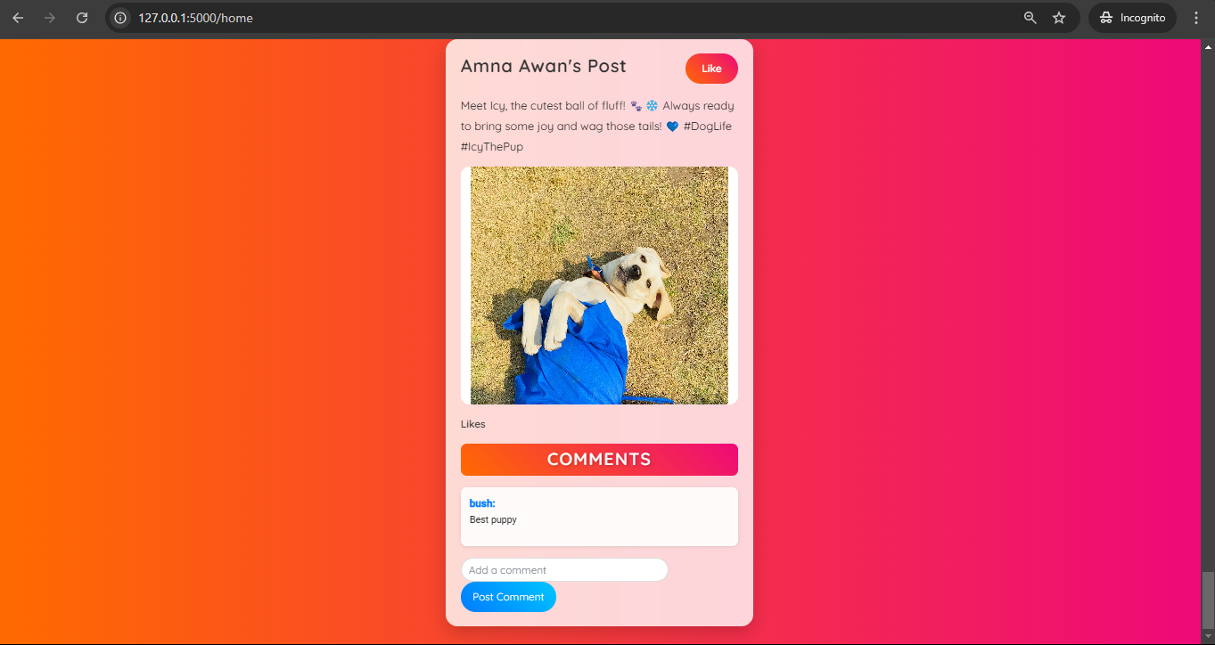
Description: The main page where users can view posts made by all registered users. Displays posts along with multimedia (images). Users can like, comment, and navigate to their profile from this page.
Functionalities:
View all posts 📜.
Add a new post (if logged in) ➕.
View posts with multimedia files 📸.
Like and comment on posts ❤️💬.
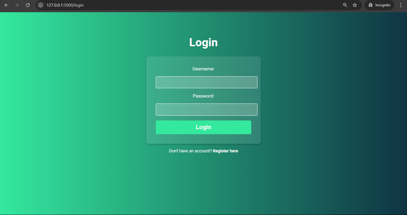
Login 🔑
Endpoint: /login
Description: The login page where users can authenticate themselves to access their account.
Methods: GET, POST
Functionalities:
GET: Displays the login form 📑.
POST: Takes the username and password, checks credentials, and logs the user in using Flask-Login 🔒.
@app.route('/login', methods=['GET', 'POST'])deflogin():
ifrequest.method=='POST':
username=request.form['username']
password=request.form['password']
# Authenticate and log in
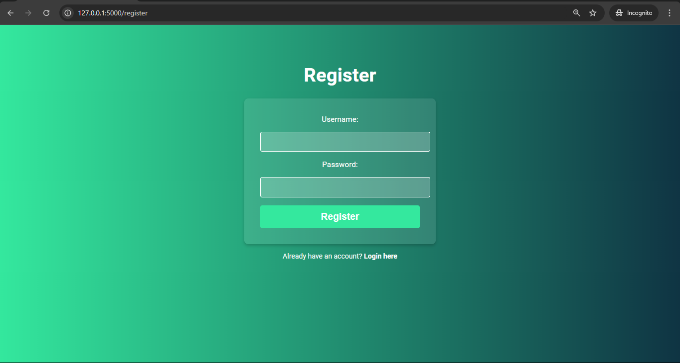
Register 🆕
Endpoint: /register
Description: The registration page where users can create a new account by providing a username and password.
Methods: GET, POST
Functionalities:
GET: Displays the registration form 📑.
POST: Registers the user, stores their username and hashed password, and redirects them to the login page 🛬.
@app.route('/register', methods=['GET', 'POST'])defregister():
ifrequest.method=='POST':
username=request.form['username']
password=request.form['password']
# Hash password and save user data
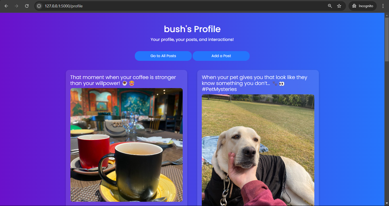
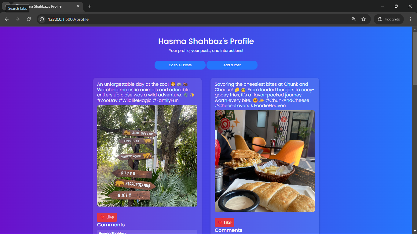
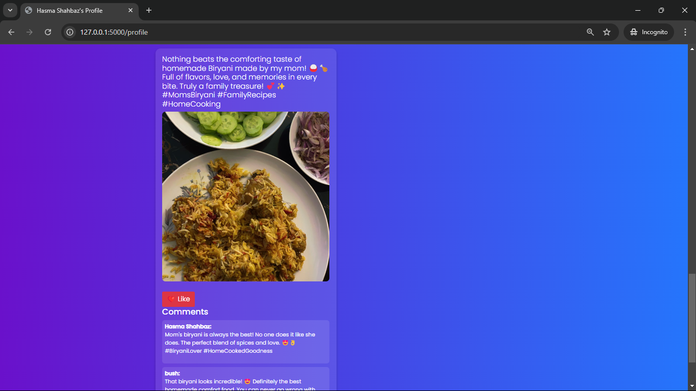
Profile 👤
Endpoint: /profile
Description: The user profile page, where users can view all the posts they have made and manage their content.
Description: Allows users to like a post. A user can only like a post once.
Methods: POST
Functionalities:
Updates the “likes” list in the post document ❤️.
Prevents a user from liking the same post multiple times 🔒.
@app.route('/like_post/<post_id>', methods=['POST'])@login_requireddeflike_post(post_id):
# Logic to add like
Comment on Post 💬
Endpoint: /add_comment/<post_id>
Description: Allows users to comment on posts.
Methods: POST
Functionalities:
Users can add comments to posts, which are stored within the post document 💬.
@app.route('/add_comment/<post_id>', methods=['POST'])@login_requireddefadd_comment(post_id):
comment_text=request.form['comment']
# Add comment to post
We as members, contributors, and leaders pledge to make participation in our
community a harassment-free experience for everyone, regardless of age, body
size, visible or invisible disability, ethnicity, sex characteristics, gender
identity and expression, level of experience, education, socio-economic status,
nationality, personal appearance, race, caste, color, religion, or sexual
identity and orientation.
We pledge to act and interact in ways that contribute to an open, welcoming,
diverse, inclusive, and healthy community.
Our Standards
Examples of behavior that contributes to a positive environment for our
community include:
Demonstrating empathy and kindness toward other people
Being respectful of differing opinions, viewpoints, and experiences
Giving and gracefully accepting constructive feedback
Accepting responsibility and apologizing to those affected by our mistakes,
and learning from the experience
Focusing on what is best not just for us as individuals, but for the overall
community
Examples of unacceptable behavior include:
The use of sexualized language or imagery, and sexual attention or advances of
any kind
Trolling, insulting or derogatory comments, and personal or political attacks
Public or private harassment
Publishing others’ private information, such as a physical or email address,
without their explicit permission
Other conduct which could reasonably be considered inappropriate in a
professional setting
Enforcement Responsibilities
Community leaders are responsible for clarifying and enforcing our standards of
acceptable behavior and will take appropriate and fair corrective action in
response to any behavior that they deem inappropriate, threatening, offensive,
or harmful.
Community leaders have the right and responsibility to remove, edit, or reject
comments, commits, code, wiki edits, issues, and other contributions that are
not aligned to this Code of Conduct, and will communicate reasons for moderation
decisions when appropriate.
Scope
This Code of Conduct applies within all community spaces, and also applies when
an individual is officially representing the community in public spaces.
Examples of representing our community include using an official e-mail address,
posting via an official social media account, or acting as an appointed
representative at an online or offline event.
Enforcement
Instances of abusive, harassing, or otherwise unacceptable behavior may be
reported to the community leaders responsible for enforcement at
[INSERT CONTACT METHOD].
All complaints will be reviewed and investigated promptly and fairly.
All community leaders are obligated to respect the privacy and security of the
reporter of any incident.
Enforcement Guidelines
Community leaders will follow these Community Impact Guidelines in determining
the consequences for any action they deem in violation of this Code of Conduct:
1. Correction
Community Impact: Use of inappropriate language or other behavior deemed
unprofessional or unwelcome in the community.
Consequence: A private, written warning from community leaders, providing
clarity around the nature of the violation and an explanation of why the
behavior was inappropriate. A public apology may be requested.
2. Warning
Community Impact: A violation through a single incident or series of
actions.
Consequence: A warning with consequences for continued behavior. No
interaction with the people involved, including unsolicited interaction with
those enforcing the Code of Conduct, for a specified period of time. This
includes avoiding interactions in community spaces as well as external channels
like social media. Violating these terms may lead to a temporary or permanent
ban.
3. Temporary Ban
Community Impact: A serious violation of community standards, including
sustained inappropriate behavior.
Consequence: A temporary ban from any sort of interaction or public
communication with the community for a specified period of time. No public or
private interaction with the people involved, including unsolicited interaction
with those enforcing the Code of Conduct, is allowed during this period.
Violating these terms may lead to a permanent ban.
4. Permanent Ban
Community Impact: Demonstrating a pattern of violation of community
standards, including sustained inappropriate behavior, harassment of an
individual, or aggression toward or disparagement of classes of individuals.
Consequence: A permanent ban from any sort of public interaction within the
community.
Naively reducing a windows of size k over an array of size n is O(k*n).
However the algorithm implemented here is O(log(k)*n) making it practical to reduce over large windows.
This packages also ships an O(n) algorithm, for extremly large windows or very costly ops.
This project allows other programs to access SSH keys stored in your Windows Certificate Store for authentication.
Benefit by Windows Certificate Management, this project natively supports the use of windows user certificates or smart cards, e.g., Yubikey PIV, for authentication.
Overview
Feature
Work with smart cards natively without installing any driver in Windows (PIV only)
Support for OpenSSH certificates (so you can use your smart card with an additional OpenSSH certificate)
Good compatibility
Compatibility
There are many different OpenSSH agent implementations in Windows. This project implements five popular protocols in Windows:
Cygwin UNIX Socket
Windows UNIX Socket (Windows 10 1803 or later)
Named pipe
Pageant SSH Agent Protocol
XShell Xagent Protocol
With the support of these protocols, this project is compatible with most SSH clients in Windows. For example:
Git for Windows
Windows Subsystem for Linux
Windows OpenSSH
Putty
Jetbrains
SecureCRT
XShell
Cygwin
MINGW
…
Installing
Install with Chocolatey
choco install wincrypt-sshagent
Manually Install
Stable versions can be obtained from the release page.
Additionally, you may make an shortcut of this application to the startup folder.
Usage
Basic Usage
Start WinCryptSSHAgent
Right-click the icon on your taskbar
You can get necessary information by selecting your interesting item in the menu
Note: Some SSH clients using Pageant Protocol, e.g., Putty, XShell and Jetbrains, needn’t any setting in system wide, thus you can’t see Pageant in the menu.
From Category, select ‘SSH’, Select ‘Use Xagent (SSH agent)’ for passphrase handling.
From Category, select ‘Authentication’ and select ‘Public Key’ as the authentication method.
OpenSSH Certificates
OpenSSH supports authentication using SSH certificates. Certificates contain a public key, identity information and are signed with a standard SSH key.
Unlike TLS using X.509, OpenSSH uses a special certificate format, thus we can’t convert your X.509 certificate into OpenSSH format.
To deal with OpenSSH Certificates, this project introduces a public key override mechanism.
If you want to work with OpenSSH certificates, you should put your OpenSSH Certificates in your user profile folder, rename them to <Your Certificate Common Name>-cert.pub or <Your Certificate Serial Number>-cert.pub.
Debug log
Run setx WCSA_DEBUG 1
Reboot to take effect
Reproduce your problem
The debug log is located in %USERPROFILE%\WCSA_DEBUG.log
Contribute
Please use issues for everything
For a small change, just send a PR.
For bigger changes open an issue for discussion before sending a PR.
SF Crime Data Analysis| Modern Data Engineering GCP Project
Introduction
The goal of this project is to create a data pipeline using Google Cloud Platform (GCP) services to process and analyze the San Francisco Crime dataset. Additionally, I aim to build an interactive dashboard using Looker Studio that provides insights into crime patterns, incident distribution, and police response in San Francisco.
Architecture:
Data Pipeline using GCP:
Data Extraction: The first step in the data pipeline is to extract the dataset from the source. I used GCP’s data ingestion tools or services like Cloud Storage to store the dataset securely.
Data Transformation: Data cleaning and transformation are crucial to prepare the dataset for analysis. I utilized GCP’s data processing tools such as Google Compute Engine to clean, transform, and structure the data.
Data Storage: Processed data will be stored in a GCP data storage solution, such as BigQuery making it easily accessible for analysis.
Data Analysis: GCP offers a range of tools for data analysis, including BigQuery for SQL-based analysis and Cloud Dataprep for visual data exploration. I will leverage BigQuery tools to gain insights from the dataset.
Dashboard Creation: Looker Studio, a data exploration and visualization platform is used to design an interactive and user-friendly dashboard. Looker allows for creating customized dashboards that enable users to explore crime data visually.
Which contains a wide range of information related to reported incidents in the city. This dataset is a valuable resource for law enforcement agencies, policymakers, and researchers to understand and address crime-related challenges effectively.
To use the dataset from my github data folder, the user will have to run a command from the “Splitting_dataset.ipynb” file to join and recreate the original dataset which is in parts in the “Dataset” folder.
The Looker Studio dashboard includes various features:
• Crime Trends: Visualizations of crime trends over time, including daily, weekly, and monthly patterns.
• Incident Distribution: Maps and charts showing the geographical distribution of reported incidents across neighborhoods and police districts.
• Incident Categories: Charts depicting the distribution of incidents by category and subcategory.
• Resolution Analysis: Insights into how incidents were resolved or closed.
• Hotspot Identification: Identification of crime hotspots based on incident density and location.
Dashboard User Interface
Advantages:
Creating a data pipeline and Looker Studio dashboard for the San Francisco Crime dataset offers several benefits:
Crime Analysis: Law enforcement agencies can use the dashboard to identify crime patterns, allocate resources effectively, and devise strategies to reduce crime.
Policy Insights: Policymakers and city officials can make data-driven decisions to improve public safety and allocate resources efficiently.
Research Opportunities: Researchers and analysts can use the dataset and dashboard to conduct studies and gain insights into crime-related topics.
Transparency: Providing access to crime data through an interactive dashboard enhances transparency and engages the community in understanding crime dynamics.
Overall, this project aims to leverage the power of GCP and Looker Studio to turn raw crime data into actionable insights, benefiting both the city of San Francisco and its residents.
Please let me know what you think about this project. Thank you for reading!
An app, that will show current and recent news from all over the world. A nice, clean, simple and interactive user interface that is easy to use. Will show user live news feed from various and trusted news sources (free API available at https://newsapi.org).
Features including –
Multiple news sources in one app (i.e. BBC, CNN, ABCNews, USA Today, Times)
The ability to save and read news offline
The ability to read news that the user saved for reading offline.
Notify the user on a fixed interval for checking the news
The ability to share a news article with friends and family on social network
Future plan (improvements) –
The ability to login and sync saved news articles across multiple devices
Search for news articles
Main goal: Design an app with current responsive user interface (with interactive animations), so that everyone can use it without the need to learn new stuff. As soon as the user opens the app, it will collect and display the user with fresh and trending news.
Requirements –
Language
Java / Kotlin & XML
Python
MongoDB Syntax
JavaScript
Node.js
IDE
Android Studio (version 3+ & Java JDK 8+)
PyCharm (with Python 3+)
WebStorm
Notepad++
Server
Amazon AWS Elastic Compute Cloud (EC2)
Ubuntu 16.10
Libraries Used
Free Libries used in this project:
Retrofit – A type-safe HTTP client for Android and Java
Glide – Glide is a fast and efficient image loading library for Android focused on smooth scrolling.
A neural network written in Python to solve XOR problem.
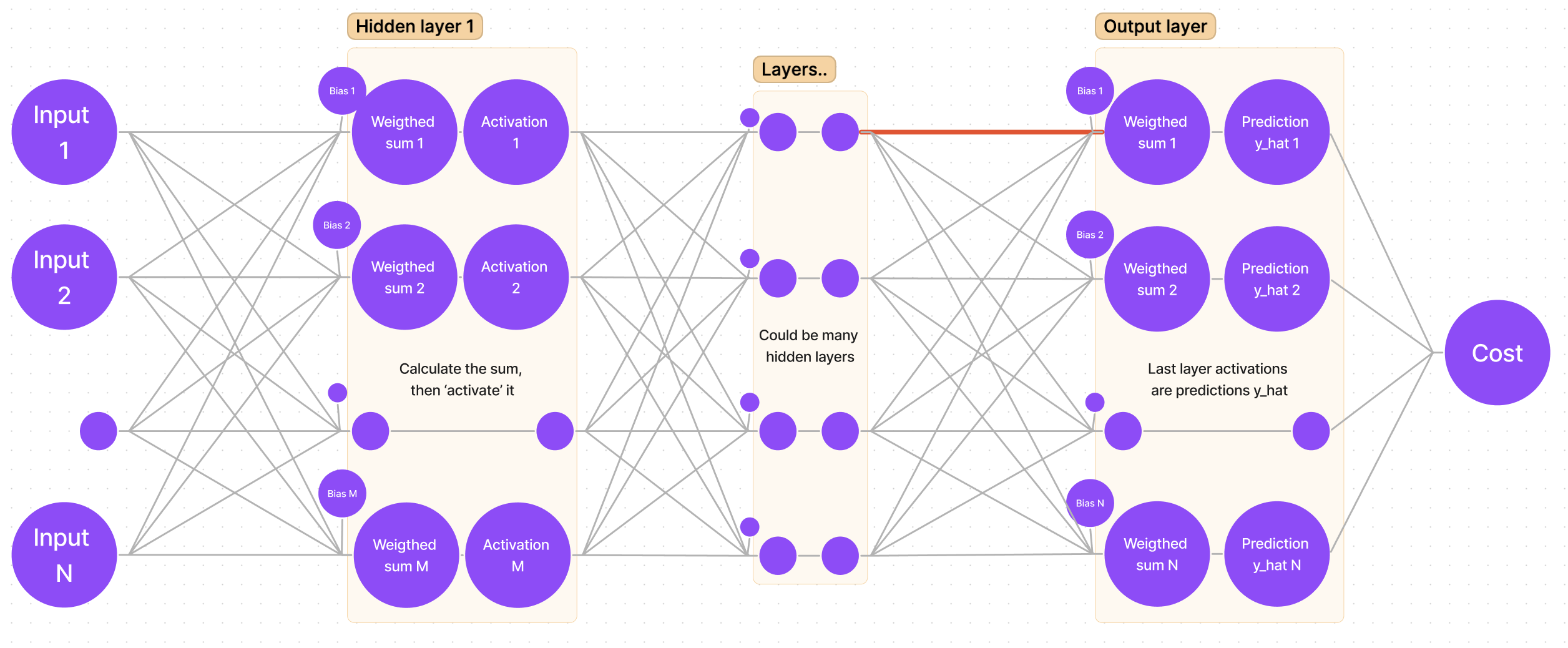
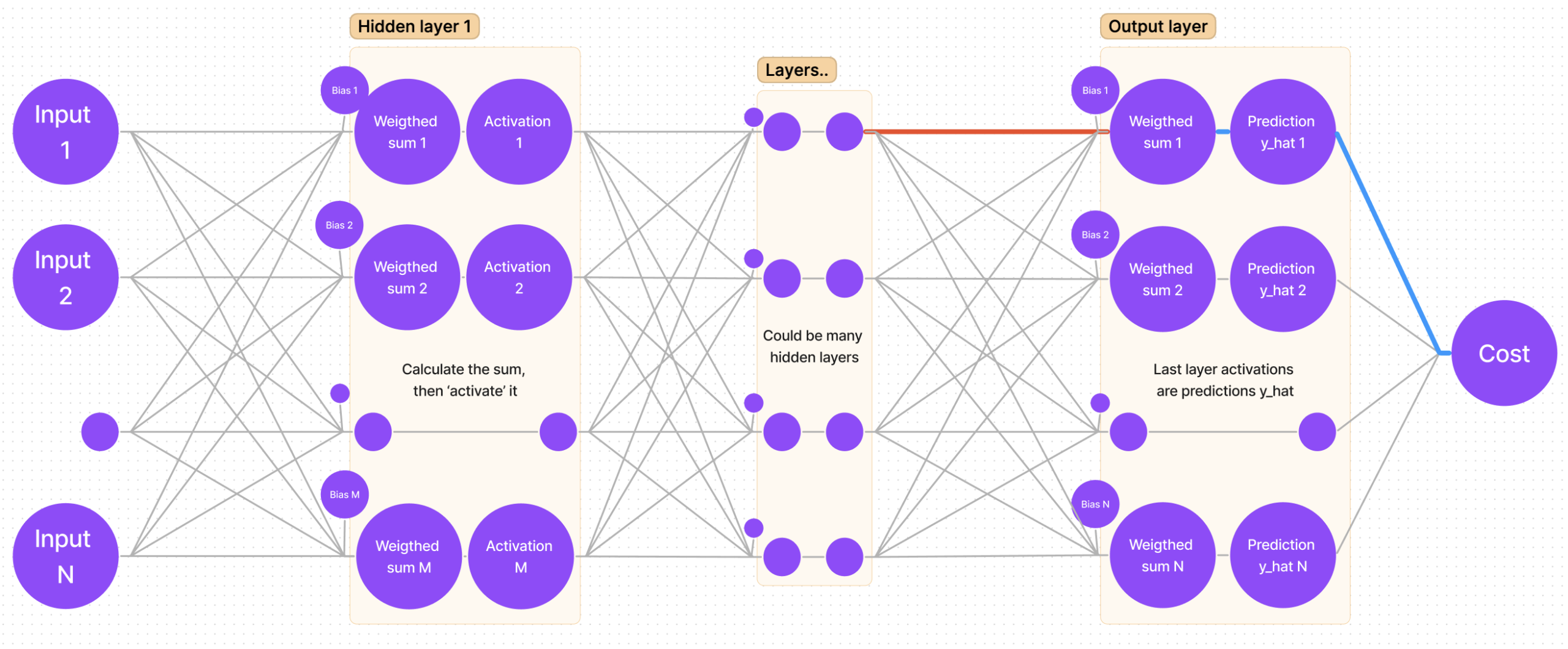
Architecture
The dimensions of this neural network can be changed dynamically. For XOR problem it is sufficient to have 2 neurons in the input layer, 10 neurons in the hidden layer, and 2 neurons in the output layer (classes ‘0’ and ‘1’). Dimensions are adjusted by this line of code:
# two input neurons, one hidden layer with 10 neurons, last layer with 2 output neurons
NN_dimensions = [2, 10, 2]

# a - number of inputs, Ln - number of neurons in hidden layers
NN_dimensions = [a, L1, L2, ..., Ln]
In this code example, the number of iterations is fixed, and the learning rate is fixed as well. This project was made with one purpose: delving into the essence of neural networks, that is, math.
Notations used in formulas for gradient calculation:
Weight notation, where (n) – layer index, i – neuron index, j – weight index:
$$W_{ij}^{(n)}$$
Bias value, where (n) – layer index, i – neuron index:
$$b_{i}^{(n)}$$
The weighted sum value z of a neuron, where (n) – layer index, i – neuron index:
$$z_{i}^{(n)}$$
The activation value a of a neuron, where (n) – layer index, i – neuron index:
$$a_{i}^{(n)}$$
The predicted output for class i, where i is the index of neuron in the last (output) layer:
$$\hat{y_i} = a_i^{(lastLayer)}$$
The expected output for class i, where i is the index of neuron in the last (output) layer:
$$y_i$$
The cost function of the whole neural network:
$$C$$
Calculations
The learning process is, in simple words, many repetitions of “moving” forward and calculating activation values, then going backward and adjusting weights and biases based on that. For the forward propagation, we use functions of weighted sum, activation and square error. For backpropagation we have to find derivatives of square error with respect to activation, then derivative of activation with respect to weighted sum, and lastly derivative of weighted sum with respect to weight.
Sum, activation, and cost functions for forward propagation
As mentioned before, it is necessary to calculate the sum values z for every neuron in every hidden layer.
We use the formula as follows (M – number of neurons in the previous layer):
The activation function of every neuron in this neural network is sigmoid.
It is calculated as follows:
$$a_i^{(n)} = \frac{1}{1 + e^{(-z_i^{(n)})}}$$
The cost function used here is slightly different from MSE (Mean Square Error). Instead of taking the mean of all square errors, we take 1/2. This is done in order for the derivative to be a bit simpler.
MSE (or C) is calculated as follows:
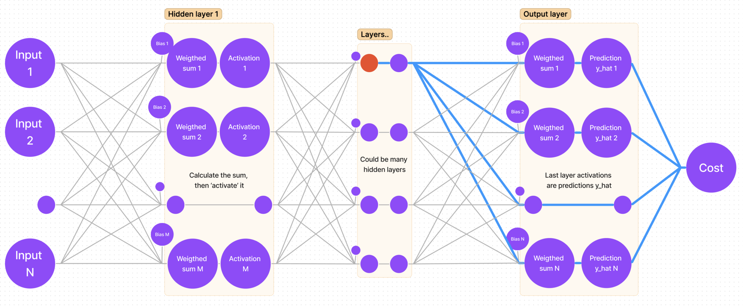
Graphical visualization of applying the chain rule in the output layer
In order to calculate the gradient for each weight we have to calculate the partial derivative of cost with respect to that weight. I find it easier to think of this process as “finding the path that leads from cost to that weight“.
If we sketch our neural network, we get a generalized graph:
First things first, we want to adjust the weights for the output (last) layer (remember, we are starting from “the end”). It means that we are looking for:
Suppose we are looking for the gradient for the first weight of the first neuron. In the sketch, that weight is marked with a bold red line:
I myself use an intuitive way for finding the derivative: follow the path from the cost function to that weight you are looking for (bold blue lines):
It is clear that we have to “traverse” through cost-y_hat, then y_hat-sum, and lastly sum-weight. That’s the same as saying: find the partial derivative of cost with respect to y_hat, then find the partial derivative of y_hat with respect to sum, and finally the partial derivative of sum with respect to weight.
Mathematical approach and applying the chain rule for the output layer
So, if we are calculating gradients for the last layer n, by following the chain rule, we get the following equation:
That’s it! Having found the gradient for each weight in the output layer, we can use it to adjust the weights:
$$W_{ij}^{(n)} := W_{ij}^{(n)} – grad * learningRate$$
Graphical visualization of the chain rule for hidden layers
Now the harder part is calculating the gradient for hidden layers. Luckily, there is a pattern for calculating the derivatives, as some of them repeat themselves in different layers’ equations. To acknowledge that pattern, we must not calculate the derivative of cost with respect to weight, but find the partial derivative of cost with respect to sum (this way we will be able to save that derivative value and use it later).
Let’s once again mark the sum of a hidden layer with the color red:
Now let’s find all paths from cost to that sum:
It is clear that there’s more than one path, but that’s quite easy to account for – the calculation is done by adding all partial derivatives that we get “traversing each path”!
Mathematical approach and applying chain rule for hidden layers
There’s one unresolved question: why take the derivatives of cost with respect to sum and not with respect to weight? As we will soon find out, there is a pattern: derivatives repeat themselves, hence calculating and saving derivatives as we move from the outer layer (BACK propagation) to ‘front’ enables us to reuse the values (note: remember what I said about “traversing all paths” and adding them up? That’s where the summation sign comes from; M – number of neurons in the next (n+1) layer):
Note how the last derivative is constant in terms of k (that value is the same for every member in the summation), so we can put it before the summation sign. Also note, that we have two partial derivatives that can be rewritten as one:
Notice how for the cost derivative with respect to sum in layer n we have to use the cost derivative with respect to sum in layer (n+1). That’s the most important part of making the code work – saving the derivatives.
Gradient descent, general expressions, and round-up
Now we know everything we need to know to use the gradient descent algorithm. Let’s sum up really quickly and get to coding!
General expressions for finding derivatives
As the most important part of the program is saving partial derivatives of cost with respect to each layer’s sum, let’s write it in a nice and concise way.
Once we have calculated all derivatives, we can adjust the weights by calculating the full gradient and subtracting it from that weight. Here we have two general formulas. First one for adjusting any weight:
Making sure your tailor-made error solution is seamless!
The Error Tailor offers seamless handling of form errors, saving you the trouble of repeating the error boilerplate.
It’s fully customizable, so you can control when, where, and how each form field’s errors are displayed.
Sit back, relax, and let the Error Tailor do all the work!
Getting Started
Run npm install @ngneat/error-tailor and add the imports to your application:
import{provideErrorTailorConfig}from'@ngneat/error-tailor';bootstrapApplication(AppComponent,{providers: [provideErrorTailorConfig({errors: {useValue: {required: 'This field is required',minlength: ({ requiredLength, actualLength })=>`Expect ${requiredLength} but got ${actualLength}`,invalidAddress: error=>`Address isn't valid`}}})]})
The errors config property takes a partial Provider, that should provide a HashMap<string | (err:any) => string> that is an object with keys corresponding to the errors name that you want to handle, and values that can be a simple string, or function that return a string used as error message to be shown.
This function runs inside the directive injector context.
Now the only thing you need to add is the errorTailor directive to your form:
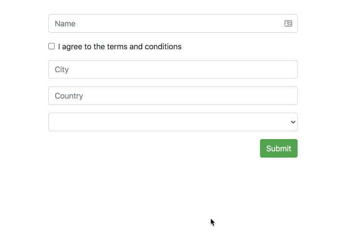
<form[formGroup]="form" errorTailor><divclass="form-group"><inputclass="form-control" formControlName="name" placeholder="Name" /></div><sectionformGroupName="address"><divclass="form-group"><inputclass="form-control" formControlName="city" placeholder="City" /></div><divclass="form-group"><inputclass="form-control" formControlName="country" placeholder="Country" /></div></section><divclass="form-group"><selectformControlName="animal" class="form-control"><option*ngFor="let option of options; index as index" [ngValue]="option">
{{ option.label }}
</option></select></div><buttonclass="btn btn-success">Submit</button></form>
The directive will show all errors for a form field automatically in two instances – on the field element blur and on form submit.
Inputs
controlErrorsClass – A custom classes that’ll be added to the control error component and override custom classes from global config, a component that is added after the form field when an error needs to be displayed:
controlErrorAnchor – A custom anchor element for the control error component. The default anchor is the form field element:
<divclass="form-check form-group"><inputtype="checkbox" formControlName="terms" id="check" [controlErrorAnchor]="anchor" /><labelclass="form-check-label" for="check">
I agree to the terms and conditions
</label><ng-templatecontrolErrorAnchor#anchor="controlErrorAnchor"></ng-template></div>
The custom anchor can also be added as a directive, in which case it’ll act as the anchor for any nested form fields:
<divclass="form-check form-group" controlErrorAnchor><inputtype="checkbox" formControlName="terms" id="check" /><labelclass="form-check-label" for="check">
I agree to the terms and conditions
</label></div>
controlErrors – Additional errors to use for the form field, that aren’t specified in the config:
controlErrorsIgnore – A custom attribute on a form field element to skip instantiating of a control error component on it.
One typical case when to use it is radio buttons in the same radio group where it’s enough to show only one error message and not all of them for each separate radio button.
showError() – Programmatic access to show a control error component (without a blur or a submit event). A validation error should still exist on that element. The key is the published exportAs reference of errorTailor to a directive instance of ControlErrorsDirective and calling its public method showError().
Syntax as @ViewChild('gdprErrorTailor', { static: true }) gdprErrorTailor: ControlErrorsDirective; is used to get the reference and later call this.gdprErrorTailor.showError().
hideError() – Programmatic access to hide an already shown control error component with the same logic as showError(), so for example: this.gdprErrorTailor.hideError().
controlClassOnly – Optional. If true, the error component won’t be created and only the error class will be added to the control. Default is false.
controlErrorsClass – Optional. A custom classes that’ll be added to the control error component. Can be override if you set attribute controlErrorsClass on control
controlCustomClass – Optional. A custom classes that’ll be added to the control if control has error. Can be override if you set attribute controlCustomClass on control
controlErrorComponent – Optional. Allows changing the default component that is used to render
the errors. This component should implement the ControlErrorComponent interface. If you only need to
replace the error component’s template, you may derive it from the default component,
DefaultControlErrorComponent, and provide the requisite HTML template.
A common example is when using Ionic forms where each form field is wrapped in an ion-item and errors
are best displayed as a sibling ion-item of the field. Example below shows how this can be done using
a custom control error component.
For example:
// Custom error component that will replace the standard DefaultControlErrorComponent.
@Component({standalone: true,imports: [errorTailorImports],template: ` <ion-item lines="none" class="ion-text-wrap" [class.hide-control]="hideError"> <ion-label color="danger" class="ion-no-margin ion-text-wrap" stacked> {{ errorText }} </ion-label> </ion-item> `})exportclassIonicControlErrorComponentextendsDefaultControlErrorComponent{}bootstrapApplication(AppComponent,{providers: [provideErrorTailorConfig({errors: {useValue: {required: 'This field is required'}},controlErrorComponent: IonicControlErrorComponent})]})
controlErrorComponentAnchorFn – Optional. A hook function that allows the error component’s
HTML element to be repositioned in the DOM. By default error components are inserted at the
bottom of the field with error. If your UI layout dictates a different positioning
scheme, you may use this hook.
Since this error element can be placed anywhere in the DOM, it also has to be
removed when the error component is destroyed. To provide for this, this
function should return a callback that will then be invoked when the error component
is destroyed. You may use this to remove the error HTML element that you inserted
into the DOM yourself.
Example below shows how the Ionic specific error component is repositioned in the DOM
to suit Ionic’s form layout. hostElem is the HTML element for the form control and
errorElem is the HTML element for the error component.
anchorIonicErrorComponent(hostElement: Element,errorElement: Element){hostElement.parentElement.insertAdjacentElement('afterend',errorElement);return()=>{leterrorNode=hostElement.parentElement.querySelector('custom-control-error');if(errorNode){errorNode.remove();}};}bootstrapApplication(AppComponent,{providers: [provideErrorTailorConfig({errors: {useValue: {required: 'This field is required'}},controlErrorComponent: IonicControlErrorComponent,controlErrorComponentAnchorFn: anchorIonicErrorComponent})]})
controlErrorsOn – Optional. An object that allows the default behavior for showing the errors to be overridden. (each individual property in the object is optional, so it’s possible to override only 1 setting)


